NeimanMarcus.com Second-Look Review
August 28, 2000
By Zimran Ahmed, Creative Good analyst
Date of original evaluation: 1/17/00
Date of second-look evaluation: 8/28/00
In our January evaluation of Neimanmarcus.com, we criticized the site for unlabeled graphics that looked like product links, but were actually category links. Customers who clicked on these graphics were sent to category pages -- not product pages as they might have expected. For example, shoppers who clicked on an image of a particular dress were sent to the dresses page that didn't even contain the item shown in the original graphic.
Even though the graphical links were unclear, customers could still use the straightforward navigation bar on the left side of the page to find items they wanted.
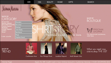
Since then, Neimanmarcus.com has been completely overhauled. The four large graphics on the original site have been reduced in size and moved to the bottom of the page. Neimanmarcus.com now follows a glossy magazine-style layout with big graphics and fancy headlines, such as "Shirt Story."
Click to see screenshot.
Unfortunately, in making this change, Neimanmarcus.com removed the underlined text links that were on the navigation bar and substituted them with rollovers. Now, when the customer moves the mouse over a category link, such as Jewelry, a gray rollover menu box pops up with a list of subcategories, including bracelets, brooches and earrings.
This new navigation system is harder for customers to use than the underlined text links from the previous design. The category links are so close together that if a customer moves the mouse only a few pixels from one category, the rollover menu changes to the next category. In addition, some rollover items are located so far from the original category link that the pop-up menu may disappear before users can get to their desired subcategory. Customers now need to know to move the mouse at a right angle -- rather than diagonally -- to get to the subcategory they want. For example, mousing diagonally to the Sunglasses subcategory from Accessories brings up the subcategory menu for Daytime Apparel. The Designer Apparel category has no pop-up menu at all, so customers might assume that category is empty. And finally, the category links themselves are harder to read -- the light-colored letters do not stand out much against the page's dark pink background.
Neimanmarcus.com should revert to the previous navigation design and focus on making the site easier for shoppers, instead of producing magazine-style layouts.
Back to home
Get Good Experience by e-mail: update@goodexperience.com
- - - - - - - - - - - -
Get e-mail updates of goodexperience.com: e-mail update@goodexperience.com
Copyright 1999-2002, Good Experience, Inc. and Mark Hurst.