
We’re making tech better.
Creative Good is a consulting firm and creative platform founded by Mark Hurst in 1997.
Members-only Creative Good Community
Become a member to gain access to our members-only Creative Good Forum, where we discuss tech news and comment on the weekly newsletter.

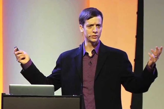
Mark Hurst Keynotes and Workshops
Mark leads workshops on AI, customer experience, and bit literacy – and gives keynote presentations.
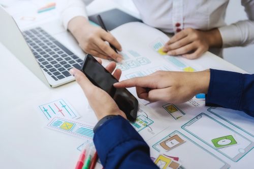
User Experience Research and Strategy
We run listening labs to reveal user insights for teams building products and services.
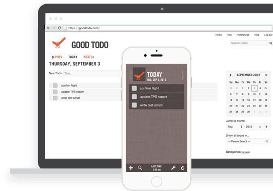
Our Productivity Platform
Good Todo is our todo list that doesn’t track you – available on web and iOS. The first and longest-running online todo list in the world.
Our Books
Mark Hurst’s books, Bit Literacy (2007) and Customers Included (2015), share his learnings of over 25 years in tech. (For more recent writing, read the blog or the email newsletter.)

Mark Hurst also hosts Techtonic, a weekly radio show and podcast on WFMU.