| In Search of E-Commerce, from Mark Hurst and goodexperience.com |
| Table of Contents | About the Second Edition | Executive Summary | Introduction | Apple | Dell | Amazon | Barnes & Noble | America Online | Microsoft Expedia | CDnow | Outtakes | Creating the Good | Authors |

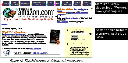
Welcome toDoes Amazon really expect consumers to read all that text? How does the text help consumers achieve their goal of buying books as quickly and easily as possible? Amazon should take a hint from companies such as Yahoo and Excite, which have simple, one-word logos. No marketing speak - just quick, clear branding with a one-word title. Customers want to find the books they want. Amazon should realize that the home page makes Amazon no money. Amazon makes money only when it gets customers off the home page and into the buying process. The home page should quickly send traffic into the buying process; the home page should not be the final destination. It’s ineffective, then, for the search form to be hidden on the right of the page, separated from the most prominent section, “What We’re Reading.” Speaking of which, why is Amazon selling T-shirts in the prime real estate directly underneath?
amazon.com™
Earth’s Biggest Bookstore
2.5 million titles. Savings up to 40%.
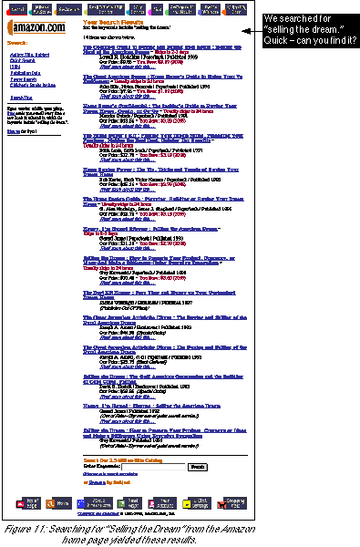
selling the dreamand then we clicked the “Search” button. Figure 11 shows the results we got. Here’s what we observed in our search results:
| Table of Contents | About the Second Edition | Executive Summary | Introduction | Apple | Dell | Amazon | Barnes & Noble | America Online | Microsoft Expedia | CDnow | Outtakes | Creating the Good | Authors |