In Search of E-Commerce, from Mark Hurst and goodexperience.com

Table of Contents | About the Second Edition | Executive Summary | Introduction | Apple | Dell | Amazon | Barnes & Noble | America Online | Microsoft Expedia | CDnow | Outtakes | Creating the Good | Authors


C H A P T E R    7

Microsoft Expedia

All roads lead to Redmond.

http://www.expedia.com


Travel is one of the hottest areas of e-commerce. It comes as no surprise, then, that the 800-pound gorilla of the Net has launched its own travel site.

We weren’t sure what to expect from Microsoft Expedia, since some of Microsoft’s past “first tries” have yielded less than extraordinary results. We thought Expedia might launch like Windows did: a nearly unusable first version, followed by incremental improvements evolving into a decent product years later. (Expedia ’05?)

But Microsoft Expedia surprised us, turning out better than we expected. Despite a few glaring errors in the initial pages, most Expedia pages made for a smooth, easy buying experience. With a few improvements, Expedia could evolve into a truly excellent e-commerce site.

The goal of our Expedia test was to buy a round-trip plane ticket from New York to Seattle.

The Home Page

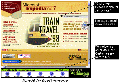
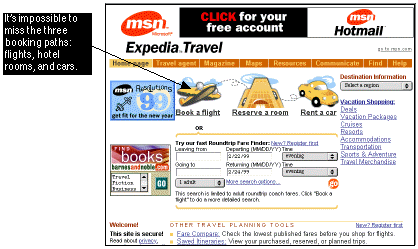
Unfortunately, we found the Expedia home page (see Figure 20) to be one of the weakest on the site.


Expedia’s home page fails on four counts:

It’s impossible to overstate the importance of a fast and focused home page. Web users have tiny attention spans, in spite of (or because of) the ever-increasing number of websites trying to attract them. When a user comes to a home page, the page has the page has only one chance to quickly and clearly describe the benefit of staying on that website. Anything short of a fast, focused experience will drive customers away.

In Expedia’s case, visitors to the home page have to deal with excessive graphics, ads, and the distracting train promotion. Expedia undoubtedly has lost customers to competitors because of its slow, scattered home page design.

After spending precious seconds scanning the Expedia home page, we guessed that the Travel Agent link probably was our best bet for buying a plane ticket to Seattle.

Travel Agent Preregistration

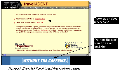
We were disappointed to find that we had to go through a lengthy sign-up process just to use the Travel Agent feature. On the other hand, we were pleased to find that Expedia explained this clearly to us on the Preregistration page (see Figure 21).


Compare this page to Amazon’s Continue Your Order page (see Figure 12), which hides a similarly simple choice within several screenfuls of text. Expedia’s page is much easier to use.

Again, however, we wonder why Microsoft included an advertisement on this page. It slows down the page with a frame and a useless, unnecessary graphic - on a page where users have to make the delicate choice of whether to sign up. The ad banner only encourages customers to abandon Expedia.

The Travel Agent Page

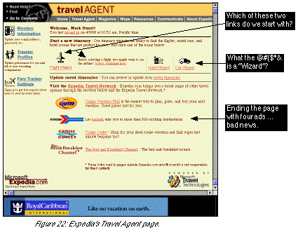
With the registration process behind us, we proceeded to the Travel Agent page (see Figure 22), which, like the home page, had some striking weaknesses.


As best we could tell, Travel Agent mainly lets customers do three things: Then why doesn’t Travel Agent just come out and say it? Instead of offering customers a link such as “Buy a plane ticket,” Expedia displays a link labeled “Flight Wizard.” Flight Wizard. What customer in her right mind knows what a “flight wizard” is? Or a “hotel wizard”? Or a “car wizard”: Is that a magician who fixes broken-down rental cars?

Yes, Expedia has instructions that explain the meaning of the terms. But if you need instructions to explain your jargon, there’s something seriously wrong.

Why jargon is wrong

We know exactly what Microsoft was thinking when it named those links. “Wizard” is a term commonly used by software developers to describe applications that walk users through an installation process. Many Microsoft applications feature wizards that help users through complex activities (setting up a database, for example). There are several reasons why “wizard” is a grossly inappropriate term for Expedia to use: The problem of jargon is bigger than just Expedia; many websites contain terms that are familiar to the company or industry but not to the customer. Since it makes websites harder to use, presenting customers with jargon immediately creates ease-of-use problems. Simply put:

To serve the customer, don’t use words the customer doesn’t know.

The Flight Wizard Page

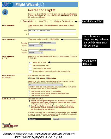
Despite its unfortunate title, the Flight Wizard page was one of the best individual pages we encountered on any site we evaluated:


Notice the following about the page: The only real error we encountered on the page is in Step 2, which asks the user to input a date, then gives instructions for the format. Here’s a rule of thumb of good ease-of-use:

If you have to give instructions, you designed it wrong.

Why couldn’t Microsoft give the user a set of pull-down menus from which to choose the month, day, and year? With this design, there would be no need for the archaic “MM/DD/YY” instruction.

The Calendar Page

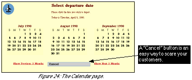
In Step 2 on the Flight Wizard page, clicking on “View Calendar” takes the user to the Calendar page (see Figure 24).

Even if users don’t read the instruction (“Please click the date you wish to depart”), this can be a useful page. Users can easily choose target departure and return dates without having to find a calendar outside of the computer. The problem, though, occurs when a user has found a date: how to get back to the Flight Wizard? Surely not the “Cancel” button: It looks identical to the trip-canceling “Cancel” button on the Flight Wizard page!


Sadly, in the midst of what otherwise is a smooth ticket-buying process, Microsoft has committed a very basic ease-of-use error on the Calendar page. By labeling the only exit sign “Cancel,” it eliminates all obvious ways for users to go back to the ticket-buying process. The “Cancel” button is absolutely the wrong name, for two reasons: If Microsoft had given the “Cancel” button an easy-to-understand name such as “Back to Flight Wizard,” these problems would have been avoided.

The Please Wait Page

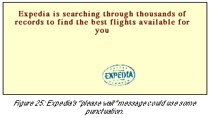
Back at the Flight Wizard page, we finished the five steps to request our ticket, and clicked the “Continue” button. Figure 25 shows the Please Wait page we saw next. We liked this page. It gave us clear feedback about what was happening - that Expedia was working to find the best flights for us. The animated Expedia logo graphic (which jumped around the screen) served as a kind of reassuring “hold music” to remind us that Expedia was doing work behind the scenes.


We were surprised, however, to see that the message itself lacked any punctuation. The lack of a period is a small thing, to be sure, but like everything presented to customers, it affects the brand image. How hard would it have been for Microsoft to run this page through a copy-edit?

This small error aside, the Please Wait page was followed by a results page, which clearly showed us the available flights and made it easy to complete the order process.

What to Learn From Microsoft Expedia

Microsoft Expedia, Eight Months Later

Of all seven sites, Microsoft Expedia underwent the greatest change since the report was first released. The home page is now radically faster and easier to use: booking paths are presented front and center, and text is used heavily instead of large print-style graphics.

Next Section: CDnow

Table of Contents | About the Second Edition | Executive Summary | Introduction | Apple | Dell | Amazon | Barnes & Noble | America Online | Microsoft Expedia | CDnow | Outtakes | Creating the Good | Authors