In Search of E-Commerce, from Mark Hurst and goodexperience.com

Table of Contents | About the Second Edition | Executive Summary | Introduction | Apple | Dell | Amazon | Barnes & Noble | America Online | Microsoft Expedia | CDnow | Outtakes | Creating the Good | Authors


C H A P T E R    3

Dell

Trying to pass customers back to Apple.

http://www.dell.com


In a recent interview, Michael Dell stated that Dell's objective “is to make, over the next few years, more than half our sales on the Internet and to migrate our customers from physical orders to electronic ordering.” 1 Translation: Dell is serious about selling computers online.

To measure Dell's chances of meeting that objective, we examined how the Dell website presents its products to customers. The presentation of products, by the way, is at least as important as the buying process itself. If the first page or two of a site gives them a negative experience, customers can easily click away to the nearest competitor. In Dell's case, any failure to serve the customer could create a new visit to gw2k.com - Gateway 2000, Dell's chief online competitor.

The Dell Home Page

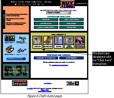
The Dell corporate home page is shown in Figure 6. Notice that at least half of the page points users to the Online Store. Driving traffic to the Online Store appears to be the primary goal of the Dell home page. We notice


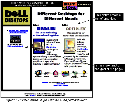
three things on the page that slow the user’s path to the Online Store: Clicking on “Desktops” from the home page took us to the Desktops page. The proliferation of graphics continued here, as shown in Figure 7.


Dell’s Desktops page is an excellent example of one of the most common problems in corporate Web design today: trying to make a Web page look like a print brochure. Take a close look at the Desktops page in Figure 7. Except for a tiny amount of text on the left and the bottom, the entire page is made of graphics. The headline, “Different Desktops for Different Needs,” is a graphic. The two paragraphs of marketing info (“Ideal for both office and home ...”) are both graphic.

Why print design should stay on paper

The advantage of graphics-heavy design is that designers can format text exactly as they like it, without having to worry about working in HTML. For example, on the Desktops page, “The Latest Technology” will always be formatted directly above “at Groundbreaking Prices,” no matter which browser, computer, or monitor a customer uses. The layout of all the text is “frozen” within the graphic. But there are serious disadvantages to this design strategy. If nothing else, graphics-heavy design breaks the single most important design rule in e-commerce: “Keep it simple.” Text is simpler than graphics - for the user and for the designer. It’s worth repeating why graphics should be minimized:

If you need an example of simplicity, text links, and minimal graphics, look no further than Yahoo. It has never strayed from a simple, text-focused design, and it’s enormously successful.

A goal for every page

One last comment on the Desktops page concerns the Year 2000 link on the left side. This link has nothing to do with the goal of the page.

One of the most important ways to be successful in e-commerce is to design each page with one goal in mind. For example, Dell could have written out this goal for the Desktops page:
The goal of the Desktops page is to get customers to choose quickly and intelligently between Dimension and Optiplex.
If Dell had committed to that goal, the Desktops page would look much different: In fact, a better-designed Desktops page would end up looking a lot like the Apple G3 Minitower page (see Figure 1).
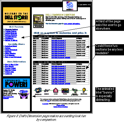
Customers who choose the Dimension line of Dell Desktops are taken to the Dimension page (see Figure 8).


The user’s eye is immediately drawn to the list of 18 Dimension configurations in the middle of the page. If Dell wanted users to be excited to buy a Dell, it failed on the Dimension page: choosing which computer to buy here is like reading a tax form.

While we applaud Dell for finally using some text links on a page, we can't figure out why this page uses a table with a total of 22 lines of data. With “Keep it simple” in mind, we can reduce the entire page to three simple questions: The goal of this page should be to get customers to quickly choose a Dimension to buy. Look at all the needless complexity Dell included on the page: Needless complexity, as seen on the Dimension page, hinders the buying process for Dell's customers.

The Build Your Own System Page

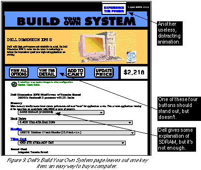
The Dell home page includes a link called “Click here to buy a Dell right now.” Users who click on that link arrive at the Build Your Own System page. Figure 9 shows the top two screenfuls.

On this page Dell has made it easy, through the use of drop-down menus, to choose from the “Chinese menu” of PC options and accessories. We were pleased with Dell's design, since it's an improvement over the designs of some of its competitors. For years consumers have been forced to order Intel-based computers from endless selections of processors, sound cards, DRAMs, HDDs, and the like. Dell's use of drop-down menus clearly shows the choices available to the consumer.

But the Build Your Own System page doesn't go far enough in reducing the jargon consumers have to see. For example, the default video card is listed as “4MB STB nVidia AGP Card.” How would a consumer know why to choose that card over any other listed in the menu? One place Dell does include helpful text is in the Memory menu - but the menu selections themselves are still listed in confusing jargon: “64MB SDRAM (2 DIMMS).”

Dell may not be responsible for the jargon in the PC industry, but it is responsible for the entire buying process on its own website. The jargon on the Build Your Own System page is a barrier to sales. Unless Dell wants to sell computers only to jargon-literate PC experts, it should minimize the “geekspeak” on its site. (Once again, we point to the Apple Store as an excellent example of how to sell computers without all the jargon.)


We have two other criticisms of the Build Your Own System page: one about yet another animated graphic, and the other about closing the sale.

Why to avoid animation

In the upper-right of the Build Your Own System page is a graphic that continuously flips over, in 3D, to display various marketing messages. Presumably the overall goal of the page is to get customers to quickly choose their components and move on to finalize the sale. That goal is not served by this distracting animation. There’s a reason many advertising banners on the Web are animated: animation draws attention. Some studies have shown that animated graphics on a Web page can even irritate users 4. So why hit users with a distracting, irritating, flippy graphic that says “Experience the Power”? This graphic is worse than useless: It hurts the buying process. (And if the animation was required by contract, we’d remind Intel that distracting users doesn’t make Intel any money, either.)

Always close the sale

On the bottom of the page is a toolbar of four buttons (identical to those shown in Figure 9): “View All Options,” “View Item Detail,” “Add To Cart,” and “Update Price.” Each button is presented in an identical rounded box, and each title is written in the same font.

When the customer finishes choosing her options from the pull-down menus, she arrives at the bottom of the page ... and what next? Does Dell make it clear, from that toolbar, which is the obvious next step in the buying process? No. The “Add To Cart” button, arguably the most important button on the page, has two major problems: With a bad location and a bad title, the crucial “Add To Cart” button is doing Dell a disservice. Imagine how much easier it would be for the customer to buy if there was a prominent text link, set apart from all other elements on the page, called “Click here to buy this computer.”

What to Learn From Dell

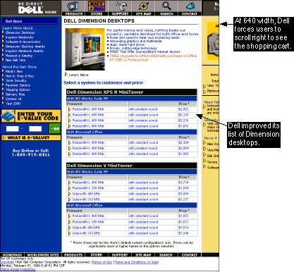
The Dell Store has improved in several ways since In Search of E-Commerce was first released. In addition to an overall increase in the use of text instead of graphics, the new page for the Dimension desktops is much more readable. The choice list has been chunked into four items each (see below), instead of nine in the old design.

Strangely, the new design is much wider than the 640-pixel width of many computer monitors. At this resolution, users have to scroll right to see their shopping cart - not an improvement for those users.

On the bright side, we noticed that the dancing Intel bunny has departed the left-hand column, making the page load faster and focus more on the buying process.


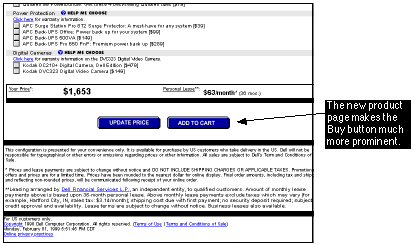
On the product page itself, Dell has made the “Add to Cart” button more prominent, as shown below. While the old design had “Add to Cart” sandwiched between three other identical buttons, the new design shows it beside only one other button.

Next Section: Amazon


1 From an April 1998 interview by the financial daily Les Echos.

2 Ideally, processor speeds would be accompanied by English words describing what the numbers meant. Example: “333 (fastest, most expensive).” The Apple Store is a good example of jargon-free PC sales.

3 Yes, Dell may have a contractual obligation to put the Intel bunny on the page. But Dell and Intel have the same goal: to sell PCs. The animation doesn’t help either Dell or Intel - so why is it there?

4 Distracted by an animated graphic, users in a test “first tried to scroll the animation off the page, and when they couldn’t, actually covered it up with their hands so they could read the rest of the text.” From Web Site Usability: A Designer’s Guide, by J. Spool, et al.

Table of Contents | About the Second Edition | Executive Summary | Introduction | Apple | Dell | Amazon | Barnes & Noble | America Online | Microsoft Expedia | CDnow | Outtakes | Creating the Good | Authors