| In Search of E-Commerce, from Mark Hurst and goodexperience.com |
| Table of Contents | About the Second Edition | Executive Summary | Introduction | Apple | Dell | Amazon | Barnes & Noble | America Online | Microsoft Expedia | CDnow | Outtakes | Creating the Good | Authors |

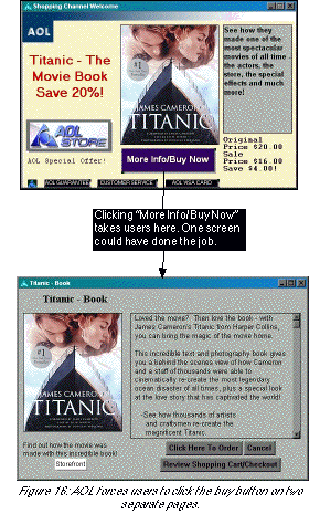
Titanic - The Movie BookDirectly under the title graphic was a button labeled “More Info/Buy Now.” Why should users have to click to get more information? Why not offer one clear function for the button: “Buy Now”?
Save 20%!
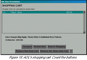 One last comment on Shopping Cart concerns the “Review Item” button. “Double-Click on cart entry to review item,” says a wordy instruction at the top. A “Review Item” button sits next to “Checkout” at the bottom of the page.
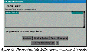
| About the Second Edition | Executive Summary | Introduction | Apple | Dell | Amazon | Barnes & Noble | America Online | Microsoft Expedia | CDnow | Outtakes | Creating the Good | Authors |