In Search of E-Commerce, from Mark Hurst and goodexperience.com

Table of Contents | About the Second Edition | Executive Summary | Introduction | Apple | Dell | Amazon | Barnes & Noble | America Online | Microsoft Expedia | CDnow | Outtakes | Creating the Good | Authors


C H A P T E R    2

Apple

The best and the worst.

http://store.apple.com


For more than a decade, the Apple brand has consistently delivered clarity - in its advertisements, packaging, and products. Say what you want about its management, but Apple has always had a clean, well-designed image. And Apple products, such as Macintosh computers, have lived up to that image.

Several months ago, during the latest Apple deathwatch in the press, Apple announced that it would start selling Macintoshes via the Web. Ever since, we've seen no press criticizing the Apple Store - and we wanted to buy a new Mac anyway - so we checked it out.

From the very first page, the Apple Store fits perfectly into the clean Apple image. It's obvious that "the Apple feel" was a top priority in the site's development. Wide swaths of white space surround clean, clear thumbnail graphics of Macintosh computers and accessories. Each page sports a large title graphic. No toolbars, banner graphics, or other bothersome items clutter up the top or sides of the page.

While there are some downsides to Apple's approach, for the most part the Apple Store was the best of the seven sites we evaluated. Each page included only the buttons and graphics that were essential to the buying process. We were delighted with the sheer simplicity of the Apple Store. In fact, many of the improvements we suggest for the other sites in this report are already present on the Apple Store.

Too Simple Won't Sell

There are, however, problems with Apple's simple approach. As much as we admire the design of the Apple Store, in some cases it went too far in pursuing elegance.

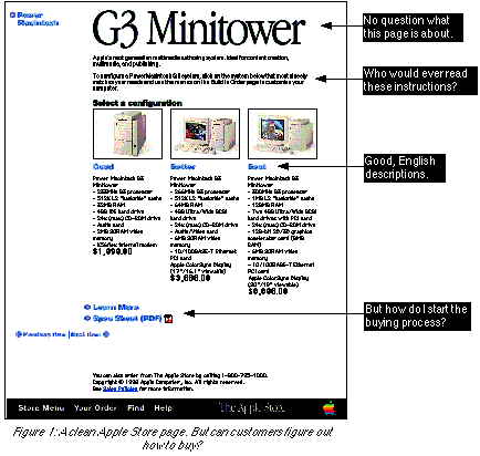
Figure 1 shows the Apple Store's G3 Minitower page.


The G3 Minitower page exhibits all the simplicity that we applaud Apple for - but nowhere does it clearly tell the customer how to start the buying process! The one instruction to users appears in the second paragraph of text at the top:

To configure a Power Macintosh G3 system, click on the system below that most closely matches your needs and use the menus on the Build to Order page to customize your computer.
This is a useless sentence. Not only is it too long and complex for most users to wade through, but it refers to a page that users haven't even seen yet.The Build to Order page doesn't appear until later in the buying process - a page that, thanks to instructions like this, users may never bother to see.
Another problem is that there is not a single text link on the entire page - and not a single visual clue that any of the graphics are clickable. In its dedication to clean graphic design, Apple left out the basic elements that users understand, such as text links and instructions to "Click here."

Even the "Select a configuration" graphic is poorly worded. "Click on a configuration" would have been a simpler, clearer instruction for users.

Three graphics we liked very much were the "Good/Better/Best" labels below each computer. With three simple words, Apple gives customers an easy way to choose the right computer. Compare this to Dell's approach of using unintelligible PC jargon to describe its products (see next section).

Overall, the G3 Minitower page fails to focus users on starting the buying process. Designing for the user, and not for Apple's beautiful design aesthetic, could have prevented the problem. The design of the G3 Minitower page points out an important ease-of-use rule:

If a user can't figure out how to start the buying process, the user won't buy.

Why Text Is Important

The overuse of graphics was a problem not only with the Apple Store. With the exception of America Online, every site we evaluated used too many graphics. To serve the customer, it's important to minimize the use of graphics on a website. There are several reasons for this: This discussion brings to mind an important rule of simple Web design:

Avoid using a graphic just to display text.

For example, the "Good," "Better," and "Best" graphics on the G3 Minitower page were three separate graphics. If they had been written as text, they would have saved the customer some time loading the page.

How to Drive Mac Die-Hards to Windows

If our evaluation of the Apple Store had ended at the G3 Minitower page, we would have concluded that Apple had built the simplest, most effective site of any in this report. But we went further into the site. What happened next was the very worst customer experience we had during our research.

As mentioned above, one of the authors of this report is a longtime Macintosh fan, having used Macs faithfully for more than 10 years. To replace his aging Mac clone, and to conduct research for the report, we decided to buy a brand-new G3 Macintosh from the Apple Store.

The Apple Store almost drove us to buy a Dell instead.

The astonishingly bad design of the Apple Store - which may very well be losing Apple customers to the Wintel world - revealed itself in the three final pages in the buying process.

The Checkout Method Page

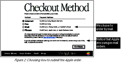
We arrived at the Checkout Method page (see Figure 2) after choosing the computer, components, and accessories to buy. Checkout Method began the last stage of the buying process by asking us to choose how we would submit our order.

Recent studies have shown that security is a top concern of potential buyers online; probably anticipating this, Apple encouraged us on this page to "fax, mail, or phone in your order." We chose to order by postal mail, by mailing in a cashier's check for the full amount of the computer. (To be fair, we'll note that most buyers probably don't choose the "Mail" option. We're sure we would have had a significantly better experience had we chosen to pay by credit card.)


After Checkout Method was a page called Shipping Info, where we chose which carrier (UPS or UPS or FedEx) to deliver the package. That page has little bearing on the present discussion, so we've omitted it to move on to the next page, Order Verification.

The Order Verification Page

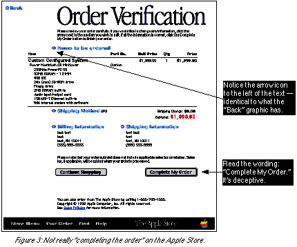
Order Verification, shown in Figure 3, appeared to be the final page in the buying process. We were presented with all order info, including system details and billing and shipping addresses. At the bottom of the page was a button labeled "Complete My Order."

We found this page, by itself, to be very well-designed. All the order information was laid out clearly and concisely. The subtotal price was shown in large type, to stand out. Except for the toolbar in the bottom frame, nothing on the page detracted from the mission of showing us our order information.


We did find one tactical mistake. For some reason, Apple designers chose to include a left-pointing arrow beside each of the four "label graphics" on the page ("Items to be ordered," etc.). This is the same arrow that appears on the "Back" graphic in the upper-left - implying that, by clicking on the label graphics, we would be taken back to another page. Were these graphics clickable? Why would they be? Without any explanation of the arrows on the page, we found this to be an obvious mistake.

Past the tactical pros and cons, there is one tremendous problem with the Order Verification page. The "Complete My Order" button at the bottom of the page does not complete the order. At precisely the most crucial point in the buying process - consummating the sale - Apple misleads the customer and puts the entire deal in jeopardy.

The Mail Your Order Page

Surprise! The order wasn't completed. Customers who follow Apple's encouragement and order via mail find out here that there's still work to be done ... a lot of work. After clicking on the "Complete My Order" button, we were taken to the Mail Your Order page - a title that simultaneously switched the voice of the site from first-person to second-person and left us wondering about the order status.

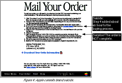
Apple then listed nine steps for us to take to mail our order (see Figure 4).


The Mail Your Order page is an excellent example of what we like to call "brand suicide." Brand suicide is the process by which a company can tick off its customers to such a degree that they happily take their business to the company's direct competitors. This page accomplished this feat with flying colors.

If we had to name the easiest way to guarantee failure in e-commerce, it would be this: Require your users to download a plug-in before ordering your product. It's so important that we'll say it again:

Don't ever require customers to download a plug-in before they buy.

Unbelievably, Apple chose to do just this. To complete the order, the customer has to use the Adobe Acrobat Reader plug-in. Not having the latest version, we had to leave the Apple site, then wait almost an hour for the download, then install the plug-in, then return to the Apple site. Had we not been researching this report, we most likely would have chosen not to buy - as hundreds or thousands of potential Apple customers probably already have.

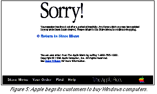
Finally, with the Acrobat Reader installed and ready to go, we returned to the Apple Store to download our Order Information. Figure 5 shows the screen that popped up:


The Sorry! page explains that our order was deleted:
Your session has timed out after a period of inactivity. Any items which you may have added to your order have been cleared. Please return to the Store Menu to continue shopping.
Our order was gone. The Apple Store had erased all the work we had done in custom-configuring a system to perfectly fit our needs. There was no way to "sign back in" to get to our past order; we had to start over.

In spite of the hundreds of hours and the millions of dollars Apple poured into its development, and in spite of its beautiful graphic design, the Apple Store made the single biggest mistake of any e-commerce site we viewed. Apple made it virtually impossible for customers to buy.

Epilogue

After the server timed out, we followed the directions - to no avail. After we clicked "Complete My Order" and downloaded the PDF file, the Apple Store staff at the 800 number had no record of our order. We eventually were able to complete the buying process, but only after we called the Apple Store's 800 number no fewer than four times trying to figure it out.

During the phone conversations, it became clear that Apple personnel had little knowledge of the customer experience on the website. One Apple phone staffer informed us that, since she couldn't find our order in the database, we must have done something wrong - i.e., it must have been our fault, not Apple's. Only later did she confirm that submitting a mail order from the website has no effect on the database. We finally discovered that the only way to order by mail is to call the Apple Store and create a new order, from scratch, over the phone.

The calls to the 800 number bring up an interesting point: In our buying process, the website saved Apple no money. We could have saved Apple time and bandwidth by skipping the website and ordering directly over the phone from an Apple staffer - in a single phone call. Though "operational savings" (i.e., a reduction in overhead costs, resulting from automation) is often trotted out as a leading benefit of e commerce, it didn't work here. In our case, the website caused Apple to incur extra operational costs. (A similar occurrence of this problem is noted in the Dell section.)

The Apple Store made every mistake in the book. Apple begged us to buy a Windows machine by: Fortunately for Apple, one of its main competitors online - Dell - had its own set of problems.

What to Learn From Apple

Next Section: Dell

About the Second Edition | Executive Summary | Introduction | Apple | Dell | Amazon | Barnes & Noble | America Online | Microsoft Expedia | CDnow | Outtakes | Creating the Good | Authors