In Search of E-Commerce, from Mark Hurst and goodexperience.com

Table of Contents | About the Second Edition | Executive Summary | Introduction | Apple | Dell | Amazon | Barnes & Noble | America Online | Microsoft Expedia | CDnow | Outtakes | Creating the Good | Authors


C H A P T E R    5

Barnes & Noble

amazon.com with a different logo.

http://www.barnesandnoble.com


Barnes & Noble, Amazon's chief competitor online, shares many of the same strengths of Amazon. Unfortunately, it also suffers from similar ease-of-use mistakes. For example, a search on “selling the dream” yielded search results almost identical to Amazon's.

If Barnes & Noble is so similar to Amazon, why include it in the report? Two reasons: first, to point out that even in an ultracompetitive online book market, both companies are making many of the same mistakes; and second, to discuss a powerful result of Barnes & Noble's recent redesign.

Buying Tufte

To test the buying process on Barnes & Noble, we bought a recent book by one of our favorite designers: Visual Explanations, by Edward Tufte. Ironically, this excellent book on proper information design was being sold on a page that suffers from acute information overload. We counted no fewer than 20 buttons and links in just the first screenful of text, which was followed by about five more screenfuls of data.


We're not suggesting that Barnes & Noble specially design a new page to sell a book on information design. On the contrary, the problem with this page affects every book Barnes & Noble sells. Here's the problem:

Barnes & Noble makes it difficult to start the buying process. To see how, take a look at the top of the page. Amidst nearly two dozen other options, one small graphic peeps: “Add To My Cart.” The all-important buy button is designed all wrong:

Worst of all, consider what happens when customers are especially interested and go on to read the five screenfuls of reviews and commentary below. When they finally get to the bottom of the page, there's no way to buy the book. The only links at the bottom of the page are those that take customers to other pages - away from this potential sale.

This design is a great way for Barnes & Noble (and Amazon, on whose site we found the same problem) to lose sales. Hide the buy button, and deluge the user with text and toolbars, while selling a book on good information design.

The Order Summary Redesign

As we were preparing this report, Barnes & Noble launched a redesigned website, rendering some of our original comments invalid. We were pleased to see many improvements in the new design. In particular, the redesign solved one of the biggest ease-of-use problems on BarnesandNoble.com.

To understand the fix, let's examine the newly redesigned Order Summary page. After the customer adds all of his desired books to the shopping cart, and completes his payment and delivery information, there's one final step in the buying process. He must confirm his order on the Order Summary page.

As shown in Figure 14, the first text on the page emphasizes the incompleteness of the order. It reads:

Your order is almost complete.
Although this text is somewhat obscured by the huge B&N logo graphic, it does an excellent job of telling the customer immediately and directly that the order has not been placed yet. (If only Barnes & Noble wasn’t so determined to put the toolbar on every single page!)


Directly below that text, and repeated again at the bottom of the page, is the well-titled button “Press Here to Submit Your Order.” (We’re not sure why B&N didn’t choose the more common “Click Here.”) The only problem with the button is that B&N located it next to the “Cancel Your Order” button. What happens when a customer, in a hurry or not proficient with the mouse, accidentally clicks “Cancel Your Order”? The order is lost - and so is the customer.

Always separate the “Cancel” button from the “Continue” button - and if possible, don’t include “Cancel” at all.

But despite this flaw, the new Order Summary page is light-years ahead of its previous design.

Why the previous design failed

In the previous design, the Order Summary page began with this text (our emphasis added):

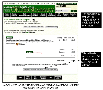
We have registered your mailing address and your preferred shipping method, and noted your shipping address (if different from your mailing address). Please print and save a copy of this page as your receipt from Barnes and Noble.
During our first test of Barnes & Noble, this one message caused us to fail in our best attempt to complete our order. When we read that our address had been “registered” and that this was our “receipt,” we assumed that the order had been placed - why else would we have been given a receipt? - and departed from the B&N website. Several days later, with no e-mail confirmation of our order, we called Barnes & Noble's 800 number. “I don't know what happened,” the B&N staffer told us, “but your order didn't go through.”

Just as in our Apple experience, we were honestly confused - and frustrated. Why didn't our order go through? We went back to the site to order again, and found Barnes & Noble's dirty little secret: After the “receipt” message at the top, after the order confirmation, way down at the bottom of the page, was a button called “Submit My Order.”

Kudos to Barnes & Noble for correcting that ease-of-use mistake. We're sure the company is enjoying higher sales and happier customers because of it.

What to Learn From Barnes & Noble Barnes & Noble, Eight Months Later

Although we could no longer find Visual Explanations in barnesandnoble.com (see the Outtakes chapter), we did find an improved design on the page for another Tufte book. As shown below, the “Add” button is much more prominent in the new design, especially since many of the header graphics have been replaced by text. Both of these changes make it quicker and easier for customers to buy.

Next Section: America Online

Table of Contents | About the Second Edition | Executive Summary | Introduction | Apple | Dell | Amazon | Barnes & Noble | America Online | Microsoft Expedia | CDnow | Outtakes | Creating the Good | Authors