In Search of E-Commerce, from Mark Hurst and goodexperience.com

Table of Contents | About the Second Edition | Executive Summary | Introduction | Apple | Dell | Amazon | Barnes & Noble | America Online | Microsoft Expedia | CDnow | Outtakes | Creating the Good | Authors


C H A P T E R    8

CDnow

It needs to know about ease-of-use.

http://www.cdnow.com


CDnow is a well-known brand. Its ads on national TV have undoubtedly brought thousands, if not millions, of Net consumers to the website. Getting tons of consumer traffic and enjoying great name recognition make CDnow a success, don’t they? Regardless of the website itself, it’s the brand that matters - right?

Yes, branding is very important - but ads and name recognition are just one part of the branding process. Once users arrive at the site, the real brand experience starts. If the website is hard to use, if it confuses and frustrates the customer, the customer leaves - and all the ad money goes to waste.

It doesn’t matter how much money you spend on advertising and marketing. If your website doesn’t serve the customer, you lose.

We make this point because we suspect that CDnow has spent more money on ads than it has on making its website easier to use. Despite the millions of dollars CDnow spends to bring traffic to the site, the lack of ease-of-use in some parts of the site hurts the brand image built up by the advertising.

The CDnow Home Page

If there’s one page that CDnow painstakingly designed to serve the customer, it’s the home page (see Figure 26). It’s easily the best page on the entire website.


Notice the following about the home page: Our only disappointment on the home page occurred when we clicked on the “Play It” button to listen to a clip of Robbie Robertson. Since we didn’t have the necessary RealAudio plug-in (as most consumers don’t), we received a Netscape error that few consumers would understand and none would appreciate (see Figure 26).

CDnow is not responsible for the wording of Netscape’s error messages, but it is responsible for the errors that appear on users’ screens. CDnow has a choice of whether to show unproductive error messages to its home page visitors. Given the choice, we would have chosen not to show customers any errors at all.

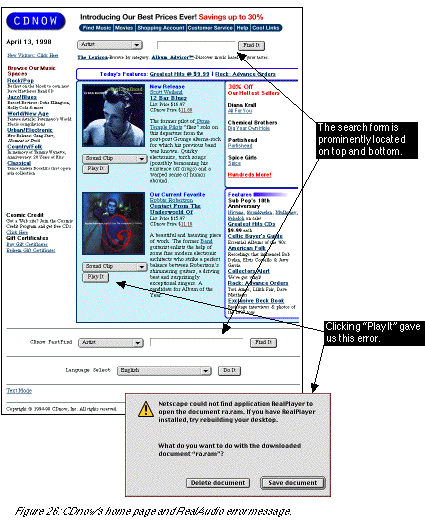
Don’t make your customers read error messages.

Along these lines, another great rule of thumb is never require plug-ins. Despite the powers of plug-ins such as Flash and Shockwave, the plain fact is that most consumers don’t even know (or care) what a plug-in is, let alone how to install one - and requiring plug-ins to view content is a sure-fire way to bring error messages, and frustration, to your customers.

To be fair, we understand CDnow’s motivation to include RealAudio on its page. One of CDnow’s strengths is the ability it gives users to listen to music clips before they buy. And Real Audio is a good choice for the software to deliver the clips. We just suggest that if CDnow keeps the RealAudio file on the home page, the “Play It” button should be accompanied by a link (such as “Click Here For Audio Help”) that leads users to a helpful, plainly worded page about how to play audio files on the CDnow site.

The Rock/Pop Page

The quick, easy design ended on the home page. When we clicked on the “Rock/Pop” music-space link on the home page, we were taken to a disappointing Rock/Pop page (see Figure 27).


At first glance, this may appear to be an attractive, well-designed page. The first thing we noticed when we arrived at the page, however, was that it was slow. The page took more than a minute to load, thanks to the numerous graphics - especially the wasteful “rock/pop” border graphic that surrounds the interior of the page. That one border graphic costs CDnow untold amounts of money. By having to wait an entire minute for the privilege of shopping on CDnow’s Rock page, customers have all the excuse they need to click off to another website. (And with that kind of experience, you can bet those frustrated customers are never coming back to CDnow.)

Looking more closely at the interior of the page, we saw that more than half of the real estate is devoted to the “Articles” section - magazine-style articles written about featured rock music topics. To the right of “Articles” is a slightly smaller “CDnow Picks” section, which lists a few selected albums.

We wonder whether it’s appropriate for CDnow to focus so much on content. After all, look at its competitors in other media: Tower Records doesn’t ask shoppers to read articles before they start browsing. Neither do mail-order houses Columbia and BMG. Tower, Columbia, and BMG sell their music by selling their music - i.e., organizing their offerings, listing them clearly, and making it easy to order. Even though the articles will drive some sales, there must be more effective designs for a “Rock/Pop” page on CDnow. Forget the slowness of the page; a few random articles and a smattering of featured albums just don’t seem to cover the topic of rock music.

Curious about the articles, we clicked on the “Los Angeles Revisited” link and arrived at the Article page.

The Article Page

Like the Rock/Pop page, the Article page took an eternity to load in our browser. Of all pages on the site, why should a text-based article slow down our CDnow experience? The culprit turned out to be two enormous graphics on the top and bottom of the page. Let’s examine the trade-offs of enormous decorative graphics: Even the navigation of the page was affected by the graphics. The bottom of the page has no navigation clue except for a mysterious “rock - more” nestled within the bottom graphic. No text link, no search form, no toolbar, no graphic buttons - just “rock - more”. What’s that supposed to mean? That we need to “rock more” in our daily lives? CDnow should follow this important ease-of-use rule:

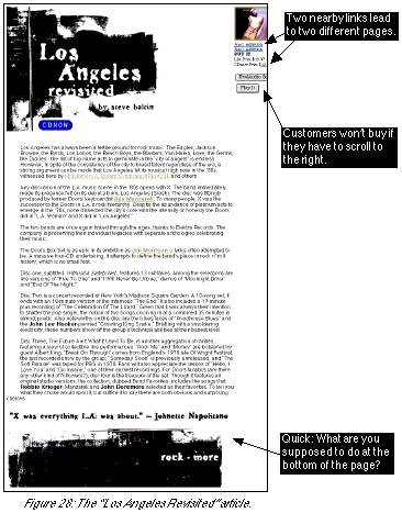
Always include a clear, easy-to-find link at the bottom of the page. Make it easy for customers to accomplish their (and your) goals.

The Article page’s featured album

Finally, like the Expedia home page, the Article page was wider than our display (a standard 640 x 480 monitor), forcing us to scroll to the right to see some parts of the page. Ironically, the part of the page we couldn’t see contained a link to buy the featured album. CDnow’s design literally hides the buying process from the customer!

Even if a customer finds the featured album, the interface is confusing. The customer must choose from three separate links that lead to two different pages. We’ll cover the buying interface more below, but it’s clear that the current design does not focus users on one clear, easy way to start the buying process.

The Album Page

Clicking on one of the Jane’s Addiction links in the upper-right of the Article page, we arrived at the Album page. Before we review the design of the Album page, let’s remind ourselves that the one, focused goal of this page should be to sell the album. Think of it this way: If customers spend lots of time enjoying the Album page, and they don’t buy the album, what does CDnow gain? Why is CDnow in business at all if it can’t sell music albums from its website?

See for yourself how CDnow tries to sell the Jane’s Addiction album (see Figure 29). The page starts with two toolbars of buttons that invite the user to leave the buying page. This is a mistake. For example, if CDnow wants the customer to buy the Jane’s Addiction album, why does the top of the page ask the user to go to the “Movies” section? After the toolbars and album info is a fairly prominent box containing the buy links. But the box contains the biggest ease-of-use mistake we found on CDnow: There’s no obvious way to buy the album. Customers who click on the words “Buy It” will be disappointed to find that “Buy It” is not clickable. And there is no “Click here to buy” instruction. The only way to buy an album on CDnow is to click on the price! We can’t emphasize enough the importance of making it easy for the customer to buy. CDnow forces users to figure out, on their own, that the price is the only way to buy on the entire page. CDnow is losing money because it didn’t follow this rule:

Always, always, always make it easy for the customer to buy.


Two other comments on the Album page:

  • The box containing the buy buttons appears again at the bottom of the page. This is a great design that companies such as Amazon should take note of. On a lengthy page, be sure to allow customers to buy at the bottom of the page.

    What to Learn From CDnow


    CDnow, Eight Months Later

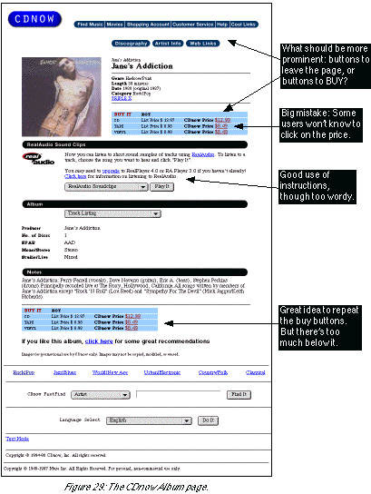
    The two changes on CDnow that the report suggested are both found on the album page (see below). Most importantly, it’s easier to buy the album, now that customers no longer have to click on the price: a prominent “Add to Cart” link is much more clear. Supporting links like “Biography” are now in text instead of graphics. We also notice that the track listing, previously contained in a drop-down menu, is now listed in two easy-to-read columns of text.

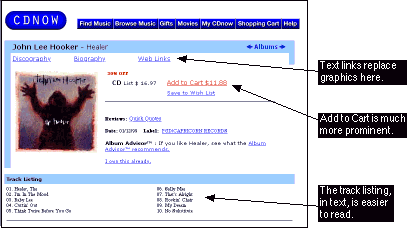
    Next Section: Outtakes

    Table of Contents | About the Second Edition | Executive Summary | Introduction | Apple | Dell | Amazon | Barnes & Noble | America Online | Microsoft Expedia | CDnow | Outtakes | Creating the Good | Authors